What were some of your first creative outlets as a kid? When did you start to paint?
I know that I started drawing very early on, but I didn’t recall painting as a child until I found a photo of me using watercolors at my grandparents’ house when I must have been about four or five. I was constantly making things using clay and paper and other materials. I loved Legos and I started building plastic models at a pretty young age. I think my obsessive/compulsive tendencies began to kick in with the Universal monster models of Creature from the Black Lagoon, Dracula, The Mummy, etc. I felt a need to collect and build all of them, even the ones I didn’t care about. I drew all the time. I was obsessed with Mad Magazine and wasn’t into traditional comics at all, but I have distinct memories of drawing micro superheroes with colored pencils, depicting them as small as possible while still keeping them recognizable. Later I became fixated on trying to replicate detailed black and white photographs in pencil. Apparently, I was a control freak from the get-go.
What’s your goal going into every painting? Is it always the same or does it differ?
It can differ depending on what I’m doing, but there is always an underlying goal to conceive of an idea and a composition that I find interesting enough to keep me as engaged as possible for the duration of the process, which can drag on for many weeks or even months, depending on size and complexity.
What would you say there is a common theme tying your paintings together?
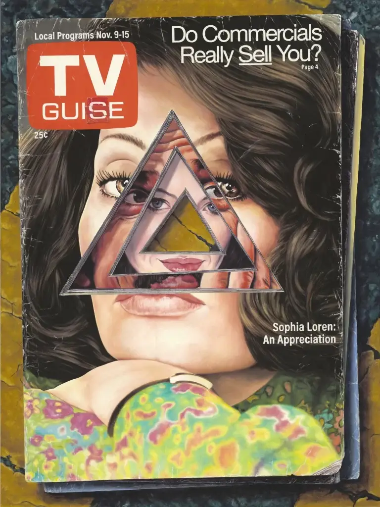
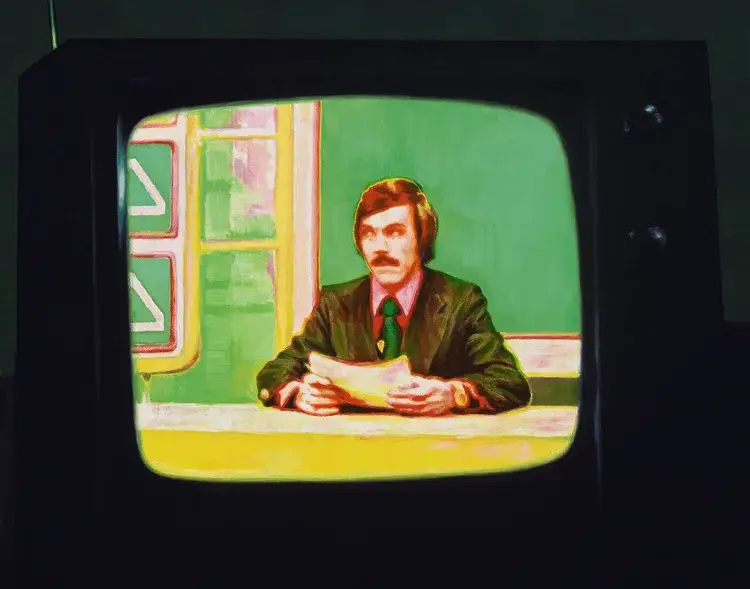
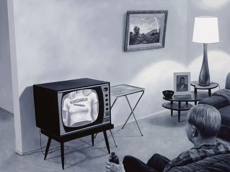
I’d say it’s an exploration and deconstruction of human psychology and perception. That is the general theme and intention in most cases, but I doubt that it communicates to the viewer in a direct way. Hopefully something rubs off on the subconscious…
What do you enjoy more, The process of designing the image or physically painting it? Which one is one more difficult?
Both can be enjoyable and/or agonizing. Overall I’d say I prefer developing a concept or a theme for a painting or a body of work, and the sketching and composing, to the actual act of painting, although when things are flowing well painting can be really fun. Being a perfectionist can be a nightmare, so I’ve made a concerted effort to change up my practice in recent years. For the most part I now typically start with a looser framework in terms of the sketch, so I can get to painting as quickly as possible, as opposed to locking every single element down first. I let things develop much more organically as a general rule now. Any opportunity to force or trick myself into not being quite so perfectionistic is usually a positive.
How closely do you pay attention to light in your paintings?
I pay pretty close attention to it, but I’m certainly no expert. I have a couple friends that are straight prodigies when it comes to technique, and know the terminology regarding the various types of light, how they’re deployed, etc., but as controlling as I am in some ways, I can also be impatient, and I’ve never wanted to get bogged down in the technical and procedural aspects, and so I mostly just wing it. It probably shows…
Who were some artists, that when you discovered them, changed or shaped your tastes?
Being exposed to the massive frieze by Diego Rivera at the Detroit Institute of Arts as a little kid had a huge impact on me. Seeing Dalí at a young age was a game changer. I didn’t know a human was capable of doing that with paint that until I saw his work. He was so free and had and insane ability to manifest the surreal in a seemingly grounded reality, which is something I strive for in my work. Studying art history at RISD opened the floodgates and I became aware of a whole new group of artists that changed my outlook on everything. George Tooker, Peter Blake, Richard Lindner, and Ed Ruscha are some that come to mind. There were many others. I discovered a lot of them while researching a freshman year assignment for a 2-D class where we were instructed to design a deck of 52 playing cards, each representing a different artist. This was pre-internet, so a project like this meant days and hours in the library combing the shelves and poring over artist monographs. It was such an amazing project and I worked really hard on it and learned a hell of a lot. I can still picture myself hunched over my crappy little desk in a shared dorm room with bad lighting and literally working for 24 hours straight to finish them for the final class of the semester. My very first all-nighter. Clearly my bad habits started early.
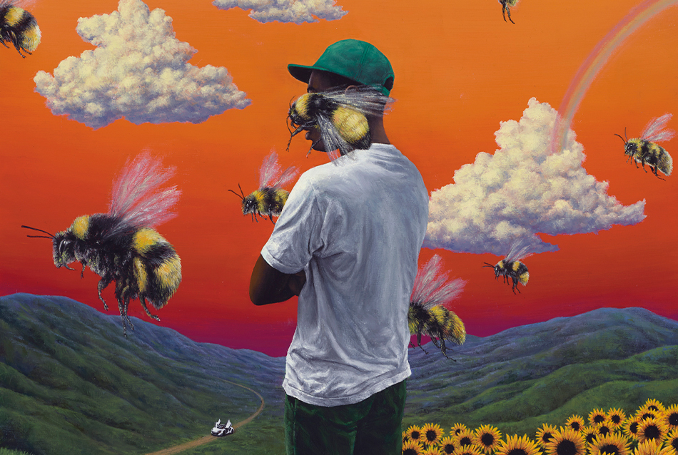
How were you presented with the opportunity to paint the album cover for Flower Boy by Tyler the Creator?
I was contacted by his manager who arranged a call. On the phone Tyler told me he had found my Rizzoli book at Barnes & Noble and that he liked my work and asked if I’d do his album cover. I had seen Odd Future play in 2011 at their first New York show, and I owned everything they had released as well as his solo records. I don’t really do commercial work much, but I was a fan of his music and so I made an exception. I loved collaborating with him on the cover and the response to that image has been incredible. He’s obviously immensely talented and innovative in multiple disciplines and he’s hilarious and has a genius business mind.
Much respect & gratitude to him for wanting to work with me.
How was the design process like for it? How much direction did they give you?
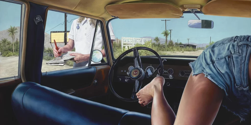
Tyler had very specific ideas about what he wanted from the very beginning. At first he mentioned a series of my paintings in which the view is from inside a car, some with multiple versions of the same characters in a single scene. So the initial idea was that we’d see Tyler in the driver’s seat from behind, with another version of him standing in front of the car. He later decided to zoom in and eliminate the other elements, so that we only see him standing in the field of sunflowers. If we had stuck with the original idea it would have resembled some of my other work, but in the end I think it was the right decision to simplify the concept. I think the end result is more focused and iconic. It would have been harder to read with all that additional information, especially given the fact that with the exception of people who still buy physical product (like me), the vast majority only see album covers the size of a fucking postage stamp.
What did you want to bring to the table with the painting?
I wanted to make an image as close to what he was envisioning as possible, and keep it true to my personal aesthetic and on par with the quality of the best paintings I’ve made. We had some back and forth up front, but settled on something we were both happy with pretty quickly, and he was great to work with and seemed thrilled with the end result and didn’t ask for any changes.
Were there any specific ideas or emotions you wanted to convey with the painting?
I think with every other album cover I’ve done I was able to preview the music before doing the artwork, and had a feel for what I was working with and could let that inform the cover image to some degree. But I didn’t get to hear any of Flower Boy before working on the image. Music is so easily leaked today, so I understand not wanting to let a single note of it out before the release. I had no way of gauging how well what I was doing would fit the music, but I trusted that Tyler knew exactly what he was doing. He did of course, and I was so happy to hear the record when it finally came out, and I do think it’s a good fit. It’s a great album and I think a huge step forward creatively for him, and I’m honored that my work is forever associated with it.
What was the hardest part of painting it?
Probably Tyler’s face. The painting is only 16 inches square, so the face was tiny and was complicated by the fact that I had to obscure his head with a giant bee while still having to maintain his likeness in the little bits of his features that were showing. Also the sunflowers were a pain in the ass.
What’s your favorite part about painting it?
I’m very happy with the way the figure came out—I think his face and arms, the clothing and folds in the fabric, and his physical gesture are successful, and he feels grounded in the physical space. I also had fun painting the weird sky and clouds. And the bees of course.

